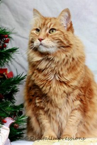
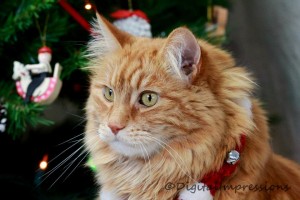
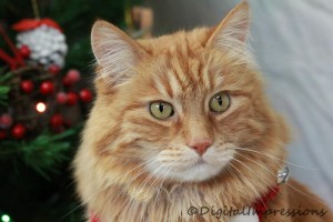
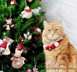
We accompanied Duncan to his Christmas photo shoot with the lovely and talented Jamie Wolfe Phillips from Digital Impressions. It was a fundraiser hosted by Duncan’s vet clinic – the Merivale Cat Hospital – in support of the Cat Rescue Network.
Now we have to choose our favourite photo from among these four and we can’t decide because we like them all. (I’m a Libran, so I’m notoriously and predictably indecisive, but GC is a Leo so he has no excuse.)
At any rate, we’ve decided to let you – the unofficial Duncan Dogcat Fan Club – decide which photo will be printed, framed, and hung on the living room wall.
You’ll find the poll at the bottom of this post. (If you’re reading this in email or a blog reader, you’ll have to come over to the blog to vote.)
PHOTO A
PHOTO B
PHOTO C
PHOTO D


They’re all great pictures, but A gets my vote. Very sophisticated!
I chose C because it showed his face the best, which holds his personality. He is a handsome dude.
Tough choice! I agree with Julia, though – what a smart looking cat!
Only a dog person who delights in embarrassing cats would vote for D.
Your point being…?
I voted for D because of its formal elegance.
I voted for A because Duncan has a great bod and should show it off.
You should see him in beachwear, Grace.
I love D the best – he looks so regal!
He’s magnificent in all of them, but I like A best as it gives a hint of his noble stature.
I think A is the best, it’s perfectly framed with only a little bit of the Christmas tree at the edge and I don’t think he needed the thing around his neck. D is too cluttered and shows too much tree.
Wow, Duncan is so handsome! He looks extremely dignified. I voted for D – it’s looks like a Christmas card from a mayor or a prime minister of animal world!!
I laughed out loud when I read this comment. If the mayor asks, I’ll let him use this photo for his Christmas card. But I draw the line at the prime minister!
What a beautiful cat!! I voted for ‘A’ cuz you can see all of him – all the pix are such ‘awesomness’.
its benita – gawd…
I’m feeling very decisive and think you should skip the poll and choose A because I say so. He is very handsome in all of them but he’s supremely regally handsome in A.
I voted for A as well, because you can see all of him and it definitely focuses on him D is far too cluttered and takes your eye away from Duncan. B and C are good as well, but I think you get more of a sense of who he is in A.
I voted for C because it looks like a painting. He’s gorgeous in all of them.
Thank you all so much for your votes, and your comments.
It looks like PHOTO A is the winner, because it captures Duncan’s magnificent, regal, handsome, dignified, beautiful, awesome, noble, elegant, smart-looking, gorgeous and sophisticated side. (Not to mention his “supremely regally handsome” side.)
I’ll leave the poll up for one more day though, just in case something happens to change the tide of public opinion. (Remember the time I had the poll about which was better, oatmeal or Neil Diamond? Oatmeal was winning until the Official Neil Diamond Fan Club caught wind of the poll, and they descended en masse on my blog. Same thing could happen here, you never know.)
I’m late to the party, but I’m voting for Photo C anyway because Duncan looks like a veteran of the Boer War or something in it, a cat that can be counted on to defend hearth and home.